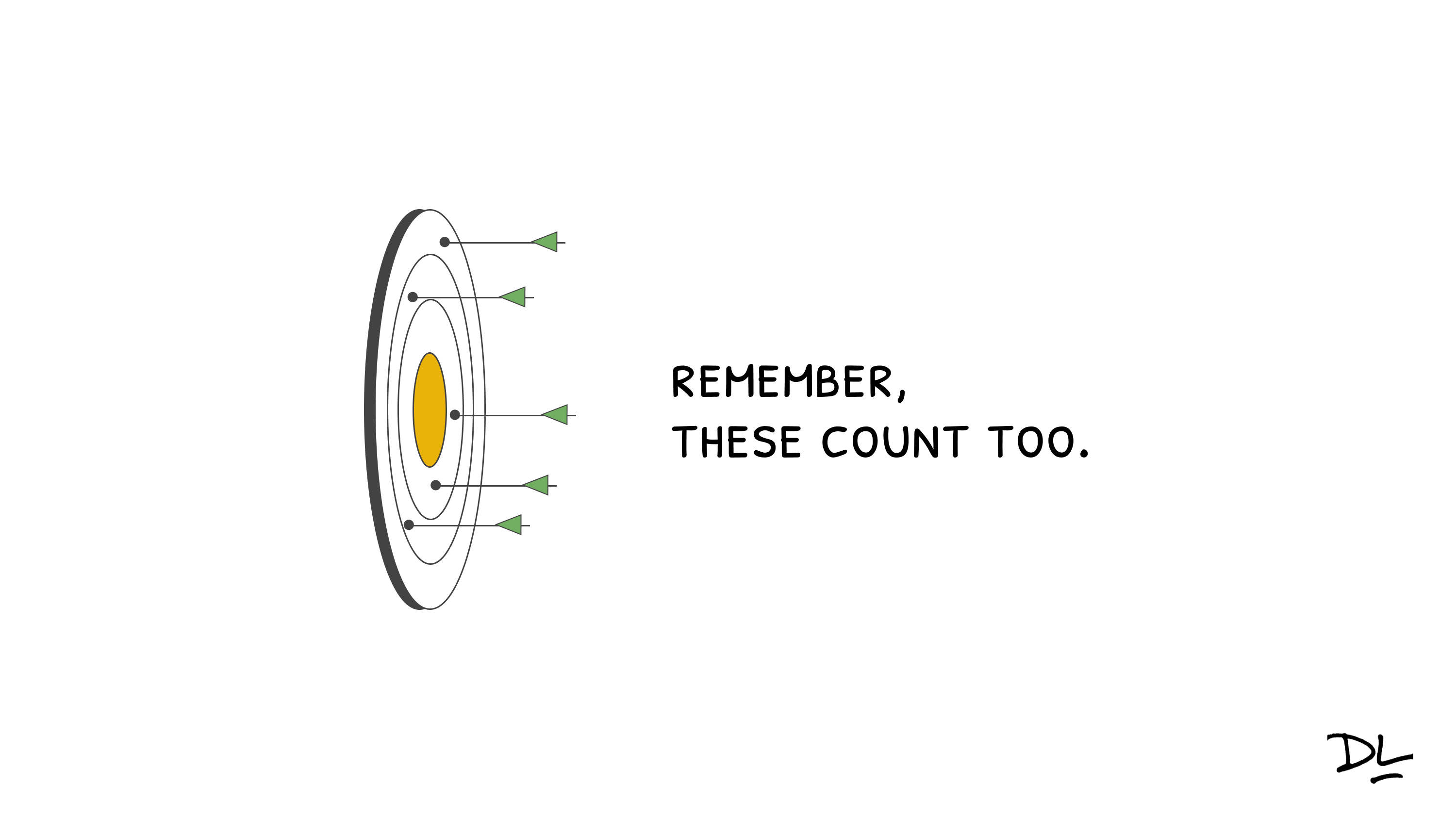
Sometimes you won’t hit your goal.
One of the things I touched on briefly in my workshop session at the Articulate Roadshow was the idea of using lightbox slides to reduce cognitive load in your course. Building lightbox slides for certain items can reduce cognitive load and focus the learner on the meat of the content rather than forcing them to click through slides on how to navigate the course.
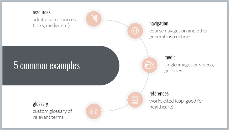
The function of the lightbox slide is to be hidden until it is opened, and then closed (or hidden) when it is no longer needed. Let’s look at a few examples of using lightbox slides to reduce cognitive load. First, here is the simple lightbox slide I created for the Roadshow workshop that depicts five common lightbox options.
 Yes, I know there is the argument that it is 2018. Do we really need to tell people how to navigate an e-learning course? And for the most part I agree that it shouldn’t be needed. However, I’ve often built this type of slide to explain the functionality of a course (glossary, contact info, resources, information about course assets such as videos, and yes, how to navigate). Think about the fact that there might be a user that needs assistance. If that slide helps one user, it’s worth being built. Unfortunately, there is also another argument for building this type of slide – someone higher up than you is mandating it’s inclusion. Regardless of the reason, if you are building a course navigation or functionality area, the lightbox slide is a great option. Putting this ancillary information on a lightbox slide pulls it out of the main flow of the course and recognizes that not everyone will need it, but it’s there for those who do.
 Depending on your industry, you may be required to include a references or works cited slide in a particular course. I’ve found this to be true in two sectors I’ve worked in – healthcare and statistical software training. You could make this the last or penultimate slide of the course. But again, not everyone will need (or want) to access this information. In my opinion, this information is perfect for a lightbox slide. It’s there if someone wants to investigate further, but again, it’s not crucial to the main flow of the course.
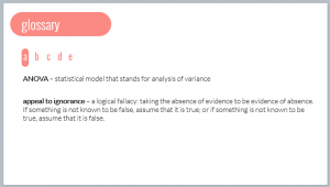 Say you want to build a custom glossary for a course. A glossary is a reference tool that is used when needed. In other words, it is an ideal candidate to put on a lightbox slide. It’s default state is hidden, but it’s always a click away when you can’t remember the definition of a particular term.
Building lightbox slides for these types of ancillary content reduces cognitive load and puts more control in the learner’s hands. The learner can access this material at the time of need, rather than being forced to view it to complete the course. What do you think? What are some other ways to use lightbox slides to reduce cognitive load?
On a fall day in October (between two hurricanes), I was a guest presenter at the Articulate Roadshow in Durham, North Carolina. I joined Tom Kuhlmann and David Anderson for a two-day workshop on building courses in Storyline. My topic was Practical Ways to Use Lightbox Slides. Since this was more of a workshop rather than a presentation, I built everything in Storyline. This made it a little tricky going back and forth between the finished examples to the actual build, but I think it worked well overall.
To capitalize on the ease of use of Articulate 360, I built everything using one of the free templates included in Content Library. One of the Main Menu slides was particularly useful in showing 5 typical uses for lightbox slides.
I decided to focus on four areas.
And since the point of the Roadshow is hands-on learning, participants had time to build their own lightbox slides and ask questions as needed.
Overall, this was a great experience for me. I’m humbled and thankful that Tom asked me to be a part of the workshop. And of course it was great to spend a little time chatting with him and David.
I’m including the source file (mainly for the folks who attended and asked for it).
Lightbox Session Storyline Source File
I also curated the following list of additional resources from the E-learning Heroes Community.
ELH Challenge #200: Using Lightbox Slides in E-Learning
Great e-learning challenge with ~40 examples submitted from the community. Check these out for inspiration and submit your own!
All About Lightboxes
Detailed article from Trina Rimmer, Articulate Community Manager, that walks through the process of creating lightbox slides.
Lightbox Note-Taking
Clever example created by community member Adam Gavarkovs of building a lightbox note-taking area for learners.
Add a Lightbox to the Course Player
Video tutorial from Trina Rimmer on how to launch a lightbox from the course player.
3 Simple Techniques for Remediation in Articulate Storyline
Articulate’s Mike Enders explains how to use a lightbox slide as a remediation technique.
The latest ELH Challenge asked members to build a circular menu navigation. One of the inspirations for this challenge was Joshua Stoner’s excellent circular menu with animation post.
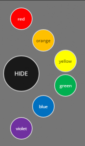 When Joshua first shared his nested menu, I really liked what he built. In fact, I modified his design and built a nested timeline. For this challenge, the requirement was to keep it a circular menu.
I frequently like to build challenge entries that serve as helpful tools to use when building in Storyline. I happened to be looking for background photos for a project and was experimenting with color overlays. So I thought I’d create a menu that allowed the user to change the color on overlays for a photo. I picked a transparency value of 75% for each color.
I created the animated SHOW/HIDE animation using Joshua’s technique. I added 6 sub-buttons so as to cover the ROYGBV color spectrum.
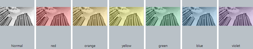 Next, I found a background picture from Content Library. Rather than use layers for color changes, I added six states to the background image, one for each color. On each state I added a rectangle overlay for that particular color and changed the transparency to 75%.
Clicking each color circle changes the background to that color overlay and allows me to decide on a color. I also added a trigger to change the background image back to Normal when the user clicks the HIDE button.
I recently read Michael Hinze’s Limiting Choices – a Storyline Question, which was a response to a question in the Heroes community where a member wanted to limit learners to making exactly 3 out of 8 choices and then display the choices on the following slide. If you aren’t already, you should follow Michael’s work on his blog, on Twitter, and in the Heroes community.
When I saw his post, I immediately thought of a course I worked on several years ago where I did something similar (in Storyline 1), so I thought I would share how I tackled the problem. The course had a few extra twists, the first being the need for two columns of items to select, but only one set that needs to persist to the next slide.
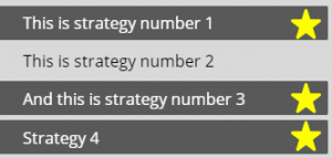
The first slide has a list of strategies for doing a particular task. The learner reads through the list and selects a check mark if he/she has used the technique. They can check as many or few of these as they like.
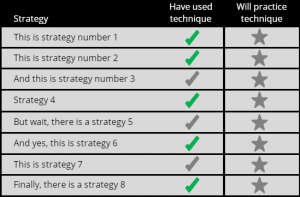
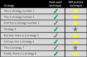
Then the learner must select 3 strategies in which they will practice the technique. These are the yellow stars. So this is where the limit comes in – exactly 3 – no more, no less.
Let’s start with the check marks. I created True/False variables for each of the check marks and set the default value to False. I created a Normal (grey) and Selected (green) state for each check mark. I also created hotspots for each check and star.
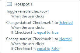 Next, I added the following triggers to each check hotspot. The first trigger toggles the Checkbox trigger between True and False. The default value is False. If the learner clicks a check, the variable changes to True and the second trigger takes affect, changing the check from grey to green. If the learner clicks the check again, the third trigger changes Checkmark back to False and the color of the check changes back to grey. Each check hotspot has these three triggers, so the learner can select as many or few of these as desired. The check marks serve as a type of review for the learner. Have I done these things or not? These do not persist to the following slide.
Now, on to the stars. I created True/False variables for each of the stars and set the default value to False. Each star has two states, Normal (grey) and Selected (yellow).
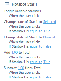 Next, I added triggers to each star hotspot. The first three triggers are the same as those I created for the check hotspots – a toggle that changes the value of the variable, and triggers that change the state of the stars between Normal and Selected. Again, the learner can select as many or as few as they want. But, I only want them to select three stars. So I added another variable, Total, to keep count of how many stars are selected, and two additional triggers that either add 1.00 to Total if True (selected) or subtract 1.00 from Total if False (not selected). The Total variable is a numeric variable with a default value of 0.
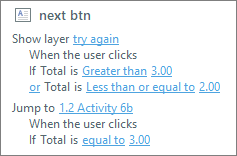 Finally, I add two triggers to the Next button. I add a layer to the slide as a gate screen. If the Total variable is greater than 3 or less than or equal to 2, the layer displays with a message reminding the learner to select three starred items. Then, when they select three items (when Total = 3), they advance to the next slide.
So that takes care of the requirement for only 3 items. The next challenge is making sure the selected 3 items appear on the next slide.
 For slide 2, I copied the 8 strategy text boxes and the 8 stars. I removed the Selected state from each star and added a Disabled state. I set the initial state for each star to Hidden. I also added a Chosen state to each text box with a dark rectangle to better highlight which strategy is chosen.
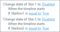 For each star I added a trigger that changes the state of the star to Disabled if the associated variable is equal to True. Variables persist throughout a course, so when you select your three stars on the previous slide, the variables associated with those stars changed to True.
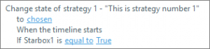 I also added a trigger that changes the state of the strategy text to Chosen if the associated star variable is True.
Another twist in this course was the request to have the learner think about and type in their plan for practicing each of their starred strategies.
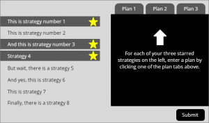
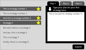 For this I added a 3-tab interaction to the slide. Each tab displays a layer. Each layer has a text entry box for learners to type their plan. When the learner is done entering their plans, they click Submit. Their entries are stored and displayed in a review slide at the end of the course via a reference variable (e.g., %plan1%).
I’ve included a demo and the source file (SL 360) if you would like to take a closer look.