I recently shared a video menu template in the E-learning Heroes forums. Here is a screenshot of what it looked like.
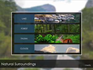
I was happy with how it turned out and thought I would share it with the Articulate community. I knew it was pretty specific, what with the nature theme and all. It would have to be re-worked (new images, new videos, etc.) to be of use to most people (unless you happen to work for a nature organization). But, I thought it was a decent base to work from.
However, over the next few days, I started thinking more and more about the design. I started thinking about being a new or relatively new Storyline user. Would I take the time to swap all of that out? Would I be overwhelmed with the thought of doing that? Would I think, “It’s nice, but I need something more practical or suited to a work environment?” Would I look at it and think, “This has no business relevance to me. How could I use this at my company?”
And so, within a few days of creating this template, I was already thinking about how I could improve it. I still think it is a decent template. But, I think it might be easier for someone to imagine using it if it had a different look and feel.
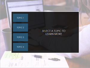
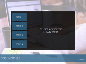
I didn’t want to start from scratch. I felt the basic structure was solid. I decided to go with a more modern, casual look (laptop, coffee, etc.) I used this image as my background.

Rather than clicking on each image to view a separate video layer, I wanted it to be a bit more seamless. I decided to ditch the linked images. Next, I made the labels smaller and made those the links to the videos.
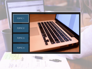
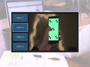
I clipped the sizes of the videos so they would fit next to the labels where the old linked images were located. I added hover states to the labels for better clarity.
I decided to leave the CLOSE button for each video layer. The learner can either close each layer, and return to a blank space with the “Select a topic to learn more” text or click through each of the labels to start a new video. Since the video layers each have a Fade transition, the fade in and out from one video to the next works particularly well.

Finally, I changed the color of the banner background at the bottom to align with the label links. I think this pulls the slide together a bit better.
While I liked the first template, I’m more satisfied with the look and feel of this one. Hopefully, it will be a bit more appealing and easier to re-purpose.
So, what do you think? I’d love to hear your thoughts. I’m including source files for both templates. Happy Storylining!
NEW TEMPLATE
OLD TEMPLATE
2 thoughts on “Working Out Loud – 30 Minute Slide Makeover”