The Articulate E-Learning Heroes community has been offering weekly e-learning challenges for community members to test their design skills and in then share what they produce with the community. I decided to jump in and design a sample for the challenge to “flatten up your course design skills.”
The objective of the exercise was to:
- Create a flat design course template. Include at least three different content slides, and more if you’d like. Your slides can be static or built out as working interactions. The objective is to show how your flat design will carry across your project.
The challenge included several references to blog posts about flat design and examples of websites built with the flat look. I found a WordPress theme called Panes that has some interesting functionality I thought I could mimic in Storyline. I encourage you to check out the site to get a better idea of the look and feel.
With regard to the basic look of the course, I wanted it clean and minimal, so I customized the Storyline Player colors down to white with a gray outline. I used several fonts from the Open Sans family. I created Menu and Help buttons in PowerPoint. I didn’t use any drop shadows in order to emphasize the “flat” look.
Other than the obvious challenge of creating the “flat” look, two main features of the WordPress theme stood out for me, the collapsible menus and the “fly-in” look of each section. Both of these lend themselves to course design. The collapsible menu allows you to maximize screen real estate and the “fly-in” sections emphasize the transition to a different lesson.
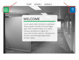
First, let’s tackle the collapsible menus. Below on the left is the Start screen. Clicking on the Menu button slides out a list of options. To close the Menu we click the Menu button again and it collapses to the left. The Help button works the same way, only to the right. The image below on the right is the expanded Menu.
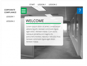
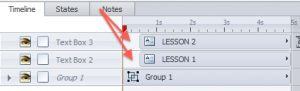
To create this slide I created two layers above the base layer, Menu and Help. Clicking on the green box slides out the Menu layer. The Menu layer consists of a Group of objects: a white rectangle, a copy of the green Menu button, and the Corporate Compliance text. I created a duplicate of the Menu button so that it would remain visible when the white rectangle slides in and allow the user to click it again to collapse the Menu. Next, I added an animation (fly-in, fast, from left) to the group. Finally, I added separate text boxes for Lesson 1 and Lesson 2 and put animations on these (fly-in, fast, from left) too. I then added a slight delay (see image below) so that Lesson 1 and Lesson 2 come in right after the group.
I placed hotspots on the Menu button on both the base layer (linking to Menu layer) and the Menu layer (linking to the base layer). I also created hover states for Lesson 1 and Lesson 2 and added a small square image next to the text to highlight the hover state.
The other effect I liked in the WordPress theme was how clicking each section caused a new background image to scroll down into the pane (see the Panes theme again for this effect). I achieved this effect pretty easily in Storyline. For the Lesson 1 slide I added a new black and white image with exact size and alignment as the image on the Start slide. I then added a white rectangle to the top of the slide, making sure part of it is off the slide (see image below – note: I added a red outline to the white rectangle for demo purposes to show the rectangle extends above the slide.).
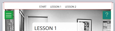
Finally, I put an animation on the background image (fly-in, fast, from top). So, the layer order from bottom to top should be: background image, white rectangle, text boxes (Start, Lesson 1, Lesson 2). The white rectangle is key for the clean look. Otherwise the image will fly in behind the text boxes. The white rectangle makes it look like the background image comes in just below the text boxes. This is a handy tip you can utilize in any course.
So that’s a brief look at how I built some of the interactions in my flat design example. I encourage everyone to participate in the Weekly E-Learning Challenge. It’s a great way to get more experience building things in Storyline, a way to share your work with other people working on the same challenge, and another item to add to your portfolio. Thanks to Articulate’s David Anderson (@elearning) for posting theses challenges every week. So, what are you waiting for? Check out the latest challenge and don’t forget to share!
Hi David. I just saw your flat design, and it’s really beautiful. Would you be able/willing to share the file as a template?
Thanks for posting this…I saw it as a link from E Learning Heroes which I sent myself and then couldn’t back track. Luckily, the url had your name and I found your website and the source file it! This is really elegant. I’m hoping to deconstruct it for one of my own courses. Thanks so much for sharing!!!
Thanks Kelly! I’d love to see what you put together.
Loved the fly-in effects! Nicely done!