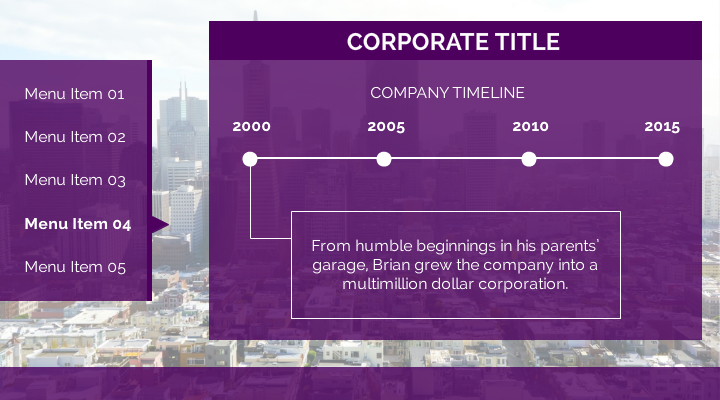
Of late, I’ve been focusing a lot on single slide design. I recently shared a video menu template and then revamped it into another video menu template. For this go-round, I decided to create a single slide template that could be used as a “get to know the company” motif for use in an onboarding course. This started out as a full-blown course template, with each menu item linking to a separate slide. The beauty of building in Storyline is that you can always find multiple ways to create the same thing. In the end, because I’m on this one-slide kick, I went that route.
I went for a clean and minimal design. It’s short and sweet. I really like using washed out background images and layering them with transparent shapes (in this case the purple menu and content blocks).

For some good examples of making your own background images, check out this E-Learning Heroes challenge.
I’m including the source file if you would like to tinker with this template.