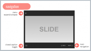
One of the things I touched on briefly in my workshop session at the Articulate Roadshow was the idea of using lightbox slides to reduce cognitive load in your course. Building lightbox slides for certain items can reduce cognitive load and focus the learner on the meat of the content rather than forcing them to click through slides on how to navigate the course.
The function of the lightbox slide is to be hidden until it is opened, and then closed (or hidden) when it is no longer needed. Let’s look at a few examples of using lightbox slides to reduce cognitive load. First, here is the simple lightbox slide I created for the Roadshow workshop that depicts five common lightbox options.
Course Navigation
 Yes, I know there is the argument that it is 2018. Do we really need to tell people how to navigate an e-learning course? And for the most part I agree that it shouldn’t be needed. However, I’ve often built this type of slide to explain the functionality of a course (glossary, contact info, resources, information about course assets such as videos, and yes, how to navigate). Think about the fact that there might be a user that needs assistance. If that slide helps one user, it’s worth being built. Unfortunately, there is also another argument for building this type of slide – someone higher up than you is mandating it’s inclusion. Regardless of the reason, if you are building a course navigation or functionality area, the lightbox slide is a great option. Putting this ancillary information on a lightbox slide pulls it out of the main flow of the course and recognizes that not everyone will need it, but it’s there for those who do.
References
 Depending on your industry, you may be required to include a references or works cited slide in a particular course. I’ve found this to be true in two sectors I’ve worked in – healthcare and statistical software training. You could make this the last or penultimate slide of the course. But again, not everyone will need (or want) to access this information. In my opinion, this information is perfect for a lightbox slide. It’s there if someone wants to investigate further, but again, it’s not crucial to the main flow of the course.
Glossary
 Say you want to build a custom glossary for a course. A glossary is a reference tool that is used when needed. In other words, it is an ideal candidate to put on a lightbox slide. It’s default state is hidden, but it’s always a click away when you can’t remember the definition of a particular term.
Building lightbox slides for these types of ancillary content reduces cognitive load and puts more control in the learner’s hands. The learner can access this material at the time of need, rather than being forced to view it to complete the course. What do you think? What are some other ways to use lightbox slides to reduce cognitive load?